Your website isn’t a brochure—it’s a sales engine. A beautiful layout without clarity, proof, and speed leaves money on the table. “Conversion-first” means every section exists to answer what this is, why it’s better, and what to do next. Below are 12 patterns we use for Gulf Coast businesses to turn casual visitors into booked calls, quote requests, and purchases.
How “conversion-first” works
Think sequence, not style. On every key page, guide visitors through: 1) What is this and who is it for? 2) Why is this better than my alternatives? 3) What’s my next best step? When design, copy, and speed support that exact order—on desktop and mobile—conversion rates climb without buying more traffic.
Pattern 1: Above-the-fold clarity
Open with a plain-English headline that spells out what you do and for whom. Add one primary CTA—Book a Free Consult—and one proof line (“Trusted by 150+ Gulf Coast businesses”). Avoid sliders. The first slide gets the attention; the rest slow the page.
Pattern 2: Outcome-driven subheads
Write subheads that summarize the payoff in one sentence: “Load fast, rank locally, and convert first-time visitors.” Scanners will get the value even if they don’t read every paragraph.
Pattern 3: Social proof mapped to objections
Place a testimonial or mini case study near each decision point. Tie proof to likely concerns: timeline, responsiveness, ROI. Add short “outcome captions” under logos, like “+38% leads in 60 days.”
Pattern 4: One path + one safety net
Give each page a single primary action (book, quote, buy) and one lower-commitment option (view examples, download checklist). Don’t force a call on a research-stage visitor; offer a safe next step.
Pattern 5: Risk reversal that’s real
Lower friction with something helpful: Free 15-minute homepage teardown or 5-point conversion review. Risk reversals build trust and start conversations without hard selling.
Pattern 6: Scannable benefit blocks
Use 3–5 short sections: headline → one-sentence proof → small visual. Common wins: Modern, Mobile, Fast, ADA-Ready, Easy to Update. Each should tie to a business outcome.
Pattern 7: Mobile-first decisions
Design phone-up. Use sticky CTAs, large tap targets, accordion FAQs, 16px body text minimum, and form fields that summon the right keyboard. More than half of visitors will read you on mobile—treat it as the primary experience.
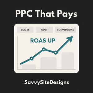
Pattern 8: Speed as a feature
Compress hero images, preload the LCP image, lazy-load below-the-fold media, preconnect fonts, and defer non-critical scripts. Aim for LCP < 2.5s, INP < 200ms on typical 4G. When you’re ready to tune deeper, see Core Web Vitals in the Green .
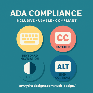
Pattern 9: Accessibility that increases conversions
Clear focus states, keyboard navigation, descriptive alt text, logical heading order, and adequate color contrast help everyone—not just screen reader users. Bake it into components from the start and spot-check with a keyboard pass. For a full run-through, read ADA Website Compliance in Florida.
Pattern 10: Navigation that mirrors decisions
Limit top-level nav to how buyers decide: Services, Work/Examples, About/Trust, Contact. Keep the rest in the footer. Add breadcrumbs on deeper pages for orientation.
Pattern 11: Trust stack near CTAs
Put review stars, security badges, guarantees, and “what happens next” copy near forms and buttons. Proximity matters—don’t strand your proof in the footer.
Pattern 12: Offer selection and next steps
Spell out expectations after they click: “Pick a time. We’ll review your site and email three recommendations before the call.” Specifics reduce hesitation and increase form completion.
Mini wireframe (text-only)
Header: logo left, compact nav right, phone on desktop
Hero: headline, one-line value, primary CTA, proof line
Proof strip: client logos or mini outcomes
Benefits: 3–5 outcome blocks with small visuals
Feature band: Modern • Mobile • Fast • ADA-Ready
Credibility: review widget + why-us
CTA band: Book a Free Consult + safety-net link
FAQ: 4–6 collapsible Q&As
Footer: contact, services, privacy, socials
Fixes for common pitfalls
Pretty but slow? Measure LCP/INP/CLS and trim assets. Too many CTAs? Pick one primary, one safety net. Generic copy? Pull real phrases from sales calls and emails. No follow-up? Automate confirmation, calendar invite, and reminder.
Costs and timeline
Most Pensacola SMB builds land between $3k–$12k depending on scope (pages, copy, photos, integrations). Typical timelines run 4–8 weeks with weekly milestones; complex shops and custom integrations take longer.